Table of Contents
kavkem colour vision more closely resembles avian colour vision than it does human or mammalian colour vision.
Biological considerations
Where humans have three different colour cones unevenly spread across the electromagnetic spectrum (our 'red' and our 'green' have nearly identical absorption peaks - it's our brain that turns the absorption patterns into sensible qualia), birds have four different colour cones that are far more evenly spread.
Additionally, birds have visual impressions further into the ultraviolet end of electromagnetic spectrum.
This implies that kavkema have four fundamental colour impressions, whereas humans have only three.
Qualia
A quale is a subjective impression of colour. You may have heard of the philosophical musing “the mysterious redness of red” - here, “redness” is the quale, “red” is the physical phenomenon. Differently worded, “red” is an electromagnetic phenomenon involving photons with a wavelength somewhere between 625 and 740 nanometers, and “redness” is the vivid colour impression you have when this phenomenon interacts with your senses.
Qualia are important when you start to think of colours as a perceptive continuum. Indeed, as a human being, you might be inclined to place all colours on a colour wheel - but this isn't quite compatible with spectral colours. Physically speaking, <fc #ff0000>red</fc> does not wrap around to <fc #8800ff>violet</fc>. Where, then, is <fc #ff00ff>magenta</fc>? It's not a spectral colour.
The source of magenta (and even its logical necessity as a quale) can be found in our colour cones - red, green and blue.
When red cones and green cones both fire, we can assume that something on the spectral line between red and green struck our retina. We see yellow and can identify it as a spectral colour.
When green and blue cones both fire, we can assume that something on the spectral line between green and blue struck our retina. We see turquoise and can identify it as a spectral colour.
But what happens when red and blue cones fire, without that green also fires? That doesn't work - there isn't any physical stimulus of a single colour that would excite the red and blue cones without also exciting the green cone. We must be seeing a mixture of red and blue.
Let's stop for a moment to appreciate what this means for us. It means we can identify “a mixture of red and blue” as a separate sensation from “a spectral colour halfway between red and blue”. We've invented additional colours! These lie on the line of purples.
However, kavkema have four basic colour perceptions of spectral colours: Valek (red), oso (green), idi (violet) and s̈elet (ultraviolet).
Let's assume for the sake of simplicity that their spectral colour perception is the same as humans, only stretched, making valek correspond to our red quale, oso to our lime quale, idi to our turquoise quale and s̈elet to our violet quale:
The kavkema do not only have the line of purples - there are other dimensions to their colour perception! Here is a table of the combinations, their qualia, and their corresponding kavkemic Kendane͡ivash terms:
| valek | oso | idi | s̈elet | spectral | Kendane͡ivash | English (kavkem) | English (human) |
|---|---|---|---|---|---|---|---|
| x | yes | valek | red | red | |||
| x | yes | oso | lime | green | |||
| x | yes | idi | turquoise | blue | |||
| x | yes | s̈elet | indigo | ultraviolet; invisible | |||
| x | x | yes | valoso | orange | yellow | ||
| x | x | yes | osodi | green | turquoise | ||
| x | x | yes | idis̈el | blue | violet, beginnings of ultraviolet | ||
| x | x | no | vals̈et | magenta | red-ultraviolet; appears just red | ||
| x | x | x | no | ||||
| x | x | x | no | ||||
| x | x | no | sos̈et | green-violet | green-ultraviolet; appears just green | ||
| x | x | no | validi | red-turquoise | magenta |
We derive that there are three imaginary lines of colour, of which we can unfortunately only imagine one:
- Colours around vals̈et correspond in quale to our 'line of purples'.
- Colours around sos̈et have no human correspondence, but are best described as lying on 'the green-violet line'.
- Colours around validi also have no human correspondence, but are best described as lying on 'the red-turquoise line'.
You may have noticed that the table combined three distinct colour sensations into one colour quale:
| valek | oso | idi | s̈elet | spectral | Kendane͡ivash | English (kavkem) | English (human) |
|---|---|---|---|---|---|---|---|
| x | x | no | vals̈et | magenta | red-ultraviolet; appears just red | ||
| x | x | x | no | ||||
| x | x | x | no |
This is because the last two variants of vals̈et do not afford a greater semantic understanding - all three of these variants involve valek, s̈elet, and at least one absent spectral impression that would otherwise lie between them. These variants come with subjective impressions of a slightly shifted hue, saturation and lightness. We will revisit this phenomenon later, and refine the translation in the process.
Hue Modifiers
Due to the way kavkem colour names were derived - with full knowledge of the spectral physics behind them, under guidance of Evenatra - hue is spectrally defined in the kavkem language. Kavkema have not bothered to give their colours fine-grained names where hue modifiers suffice.1)
The language has the prefixes vas̈' and zys̈' to modify colour hues.
Using valek as an example:
 |
||
| 1 | 2 | 3 |
The qualia range of valek reaches from red to orange. Were you to use valek without any qualifiers, it can be any of those colours - or, if you are assumed as being specific about it, it will convey a red-orange hue, about where the 2 is in our example.
If you wanted to specifically refer to red, you would use the term vas̈'valek - 'slow red'. This puts your communicated colour roughly where the 1 is in our example.
If you wanted to specifically refer to orange, you would use the term zys̈'valek - 'fast red'. This puts your communicated colour roughly where the 3 is in our example.
But wait!
Not all colours are spectral, as we already know. What about vals̈et? What would it mean for vals̈et to be either 'slow' or 'fast'? It's what you would expect if you take those words to be literal descriptors of spectral behaviour:
- zys̈'vals̈et is purple - a vals̈et with a greater violet (fast, 'blue-shifted') component than a red (slow, 'red-shifted') component.
- vas̈'vals̈et is raspberry - a vals̈et with a lesser violet (fast) component than a red (slow) component.
Vals̈et, however, we remember, is slightly special - it has three possible sensory states. What does it mean for the physical source sensation for something to be zys̈'vals̈et or vas̈'vals̈et? An obvious interpretation is for valek or s̈elet to simply have a stronger signal than the other cone, and that is what happens for the first, pure definition of vals̈et.
However, a firing cone adjacent to another cone amplifies its signal in 'imaginary' qualia - the spectral absorption curves overlap and the mind cannot tell where a spectral signal is coming from, exactly, it only knows that the sensor was triggered. Thus, valek + oso + s̈elet will have the effect that oso amplifies the valek component of the quale, whereas valek + idi + s̈elet will have the effect that idi amplifies the s̈elet component of the quale. There is no (worthwhile) overlap between oso and s̈elet, they cannot boost each other in the quale, and there is no (worthwhile) overlap between idi and valek.
Returning to our mysterious three-row entry in the qualia table, and assuming that a firing cone adjacent to another cone amplifies its signal in 'imaginary' qualia, we can be a little more precise now:
| valek | oso | idi | s̈elet | spectral | Kendane͡ivash | English (kavkem) |
|---|---|---|---|---|---|---|
| x | x | no | vals̈et | magenta | ||
| x | x | x | no | zys̈'vals̈et | purple | |
| x | x | x | no | vas̈'vals̈et | raspberry |
Of course, the overall energy reaching the eye is greater in the two latter cases, which also has an effect on lightness and saturation.
Saturation Modifiers
The kavkem language has saturation modifiers as well.
They would not think to use the word 'saturation' to describe the associated phenomenon, as a greater saturation involves a greater purity of colour, and the purer the colour, the fewer spectral components - to a kavkem, this is the opposite of 'saturation'.
Instead, their word for saturation derives from heavy (muri) the more heavy a colour, the more it displaces the other spectral colours.
The modifier word itself - amur - is a linguistic opposite of this concept, and we will translate it as diluted (or pale, even if 'pale' describes both saturation and lightness effects in English and we are here talking only about saturation effects).
| Kendane͡ivash | English |
|---|---|
| amur'inin | least diluted (= highly saturated) |
| amur'ini | less diluted (= saturated) |
| amur | diluted |
| amur'ar | more diluted |
| amur'arar | most diluted |
The term amur'inin is rarely used explicitly, as it's the default modifier for a colour. In other words, “valek” usually means “highly saturated red”, unless there is reason to assume you are using the word very broadly, based on whatever context you're using it in.
Example, again using valek:
 |
||||
| 1 | 2 | 3 | 4 | 5 |
amur'arar valek is roughly where the 5 in our example is - you can barely make out that red is stronger than the other colours in the mix.
amur'ar valek is roughly where the 4 in our example is - red is obviously visible at this point, but it looks incredibly washed out.
amur valek is roughly where the 3 in our example is - a definite red, but still rather subdued.
amur'ini valek is roughly where the 2 in our example is - the red is vivid, but not quite popping.
(amur'inin) valek is around where we have marked the gradient with 1 - bright, popping red, without any other spectral detractors.
(amur'arar also functions as a colour by itself, if it isn't followed by any colour - grey - although it is then usually shortened to amurra.)
This affects compound colours much the same way - the less they are washed out by unrelated colour components, the more 'heavy' and the less 'diluted' (amur).
Saturation modifiers also have some implications for vals̈et, the non-spectral colour we've been keeping our steady eyes on. Specifically, saturation is slightly reduced in the 'purple' and 'raspberry' colours due to the broader spectral influence on the colour impression (either oso or idi interfering with the 'pure' vals̈et colour). So we can adjust our table as follows:
| valek | oso | idi | s̈elet | spectral | Kendane͡ivash | English (kavkem) |
|---|---|---|---|---|---|---|
| x | x | no | vals̈et | magenta | ||
| x | x | x | no | amur'ini zys̈'vals̈et | slightly diluted purple | |
| x | x | x | no | amur'ini vas̈'vals̈et | slightly diluted raspberry |
Lightness Modifiers
Finally, kavkema have lightness modifiers in the form of the prefixes vem' and ath'.
Example, again using valek:
 |
||||
| 1 | 2 | 3 | 4 | 5 |
The colours depicted here are, roughly speaking:
| Position | Name | Translation |
|---|---|---|
| 1 | izi | black |
| 2 | ath'valek | dark red |
| 3 | valek | red |
| 4 | vem'valek | light red |
| 5 | zel | white |
In regards to physical phenomena, positions 1 to 3 are the only in the example that truly involve lightness. Position 3 is as light as red can get - there are no dark components to the colour. The colours between positions 3 to 5 are technically an increased lightness of all other spectral colours - in other words, a change of saturation.
Given the kavkema sensitivity to lightness, however, the importance to them is indeed the overall power delivered to the retina. When red can no longer increase in lightness, the lightness of the colour impression can be increased with the other spectral colours.
This of course harkens back to our favourite mystery colour, vals̈et! We already know saturation is slightly reduced in the two non-pure vals̈et qualia - but the overall amount of energy hitting the retina is, on average, greater than for the pure vals̈et quale. We are thus left with:
| valek | oso | idi | s̈elet | spectral | Kendane͡ivash | English (kavkem) |
|---|---|---|---|---|---|---|
| x | x | no | vals̈et | magenta | ||
| x | x | x | no | amur'ini vem'zys̈'vals̈et | slightly diluted and light purple | |
| x | x | x | no | amur'ini vem'vas̈'vals̈et | slightly diluted and light raspberry |
Combining the modifiers
Generally speaking, any order of combinations is understood and describe the same colours, except where local dialect has defined otherwise. The 'correct' order one might use in formal language, however, is:
[amur…] [ath'/vem'][vas̈'/zys̈']colour
The default modifiers that are assumed if none of a particular type are supplied are:
| Modifier | Default | Meaning |
|---|---|---|
| amur | amur'inin | fully saturated |
| ath' / vem' | neither | regular - neither light, nor dark |
| vas̈' / zys̈' | neither | regular - neither higher nor lower frequency |
Examples:
| Example | Translation | Meaning |
|---|---|---|
| valek | red | fully saturated (implied) red |
| amur'inin valek | least diluted red | fully saturated (explicit) red |
| ath'valek | dark red | dark, fully saturated (implied) red |
| amur'inin ath'valek | least diluted dark red | dark, fully saturated (explicit) red |
| ath'amur'inin valek | dark least diluted red | dark, fully saturated (explicit) red unusual grammatical form, but can be understood |
| zys̈'valek | 'blue-shifted' red | fully saturated (implied) orange |
| ath'zys̈'valek | dark, 'blue-shifted' red | dark, fully saturated (implied) orange |
| amur ath'zys̈'valek | diluted, dark, 'blue-shifted' red | medium-saturation, dark orange |
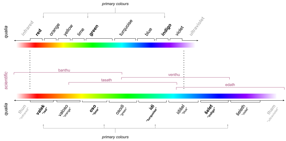
Scientific colours
Spectral colour ranges also have scientific names. With the exception of valek, each primary colour of the kavkem qualia (valek, oso, idi and s̈elet) is covered by two of the ranges, though typically associated only with one:
| scientific term | wavelength | associated quale |
|---|---|---|
| banthu | ~500 to ~700 nm | valek |
| tasath | ~400 to ~600 nm | oso |
| venthu | ~300 to ~500 nm | idi |
| edath | ~200 to ~400 nm | s̈elet |
The ~100 nm overlap implies that the colours must be shared between terms. And indeed, formally, oso is still in the banthu band, although near the edge, whereas it is closer to the center of the tasath band. Similarly, idi is still n the tasath band, but much more central in the venthu band. s̈elet manages to almost escape venthu's grasp entirely, sitting almost exactly on its edge, and perfectly central to edath:
The scientific terms are typically used when talking about the colour cones themselves, as theoretical absorption bands - they are not precisely defined by wavelength, but by the 'ideal' absorption in the retinas of creatures originating from Earth (or its scion Nekenalos).
These terms are in use by (sufficiently literate) kavkema and local Threadwielders, but not by any other sapient species with knowledge of Kendane͡ivash, any more than the kavkem dialect colour names are relevant outside of Nekenalos.